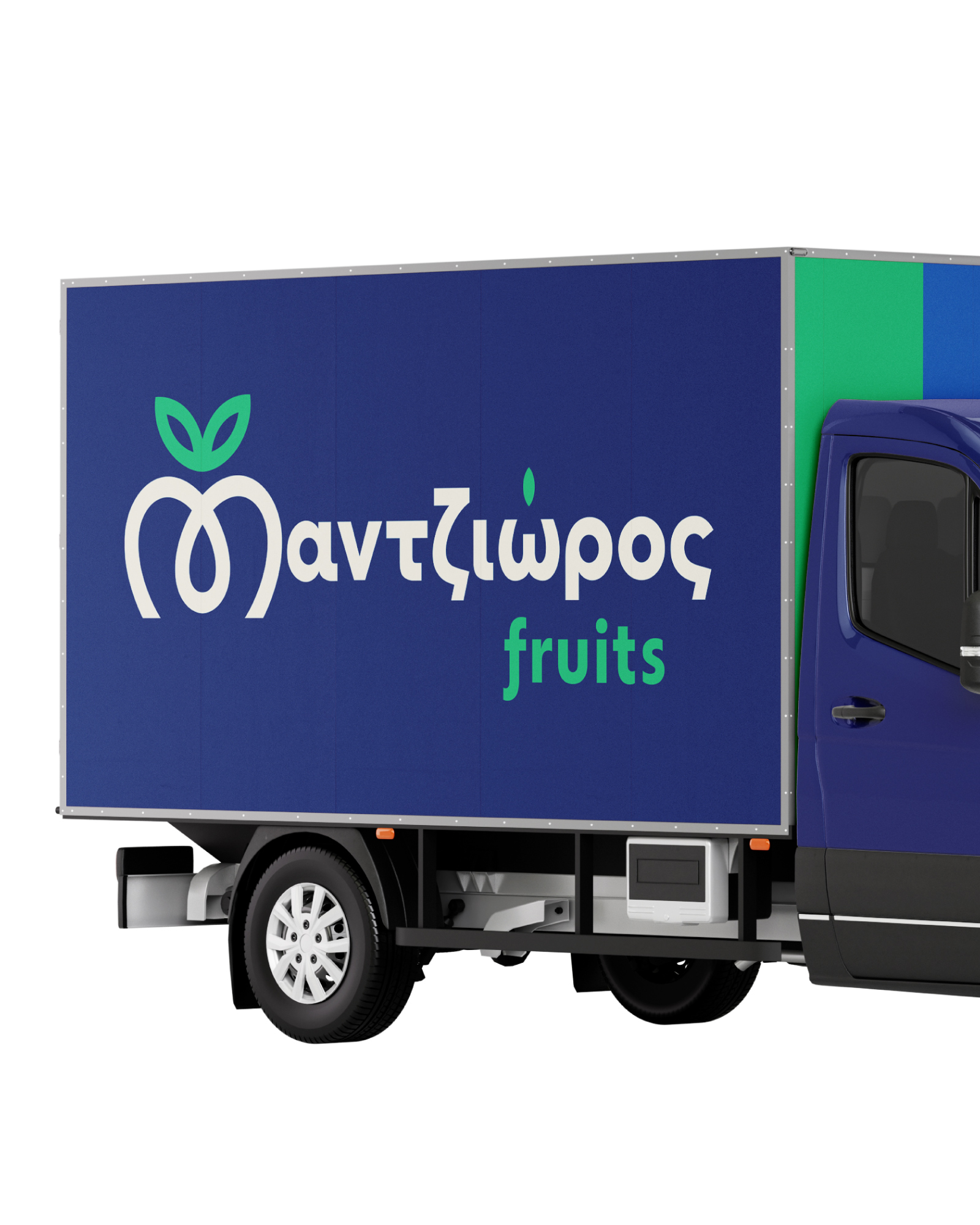
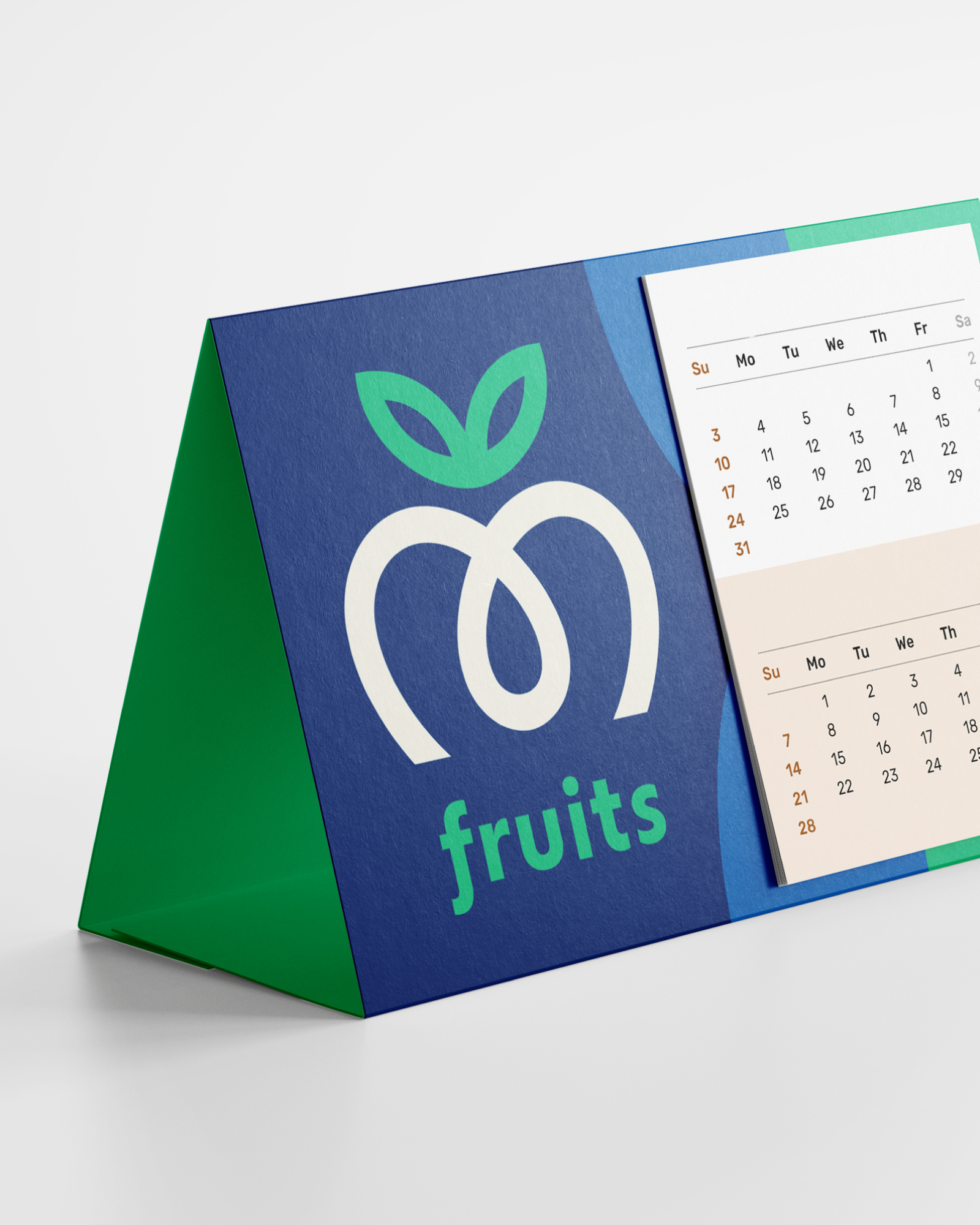
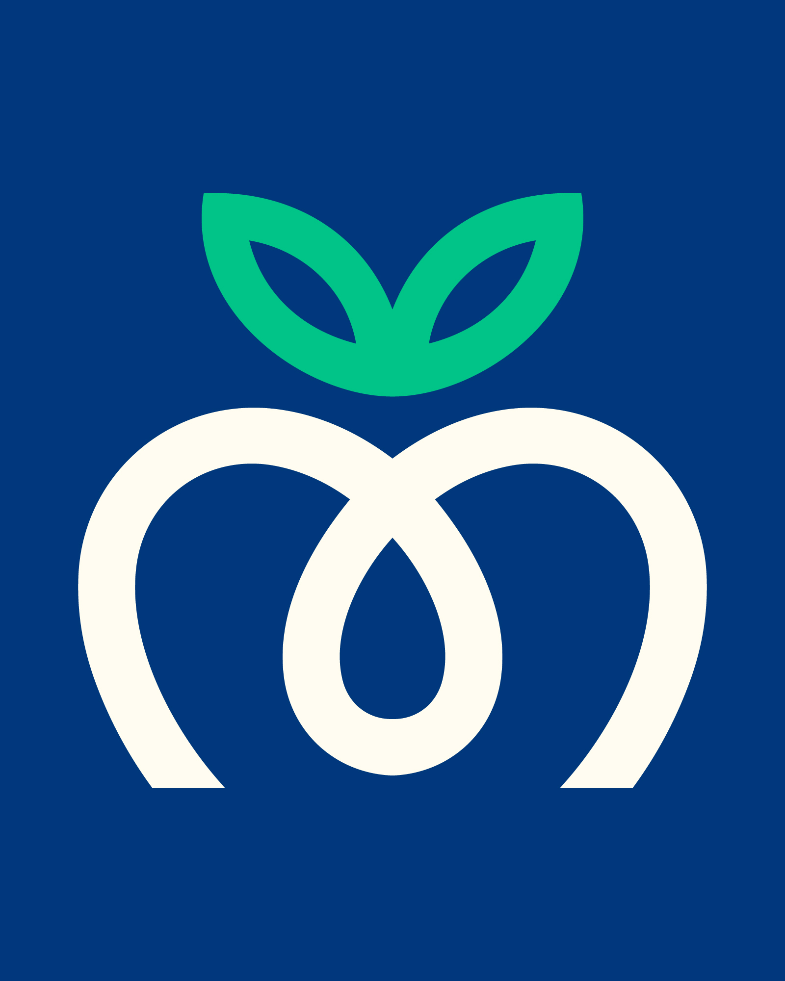
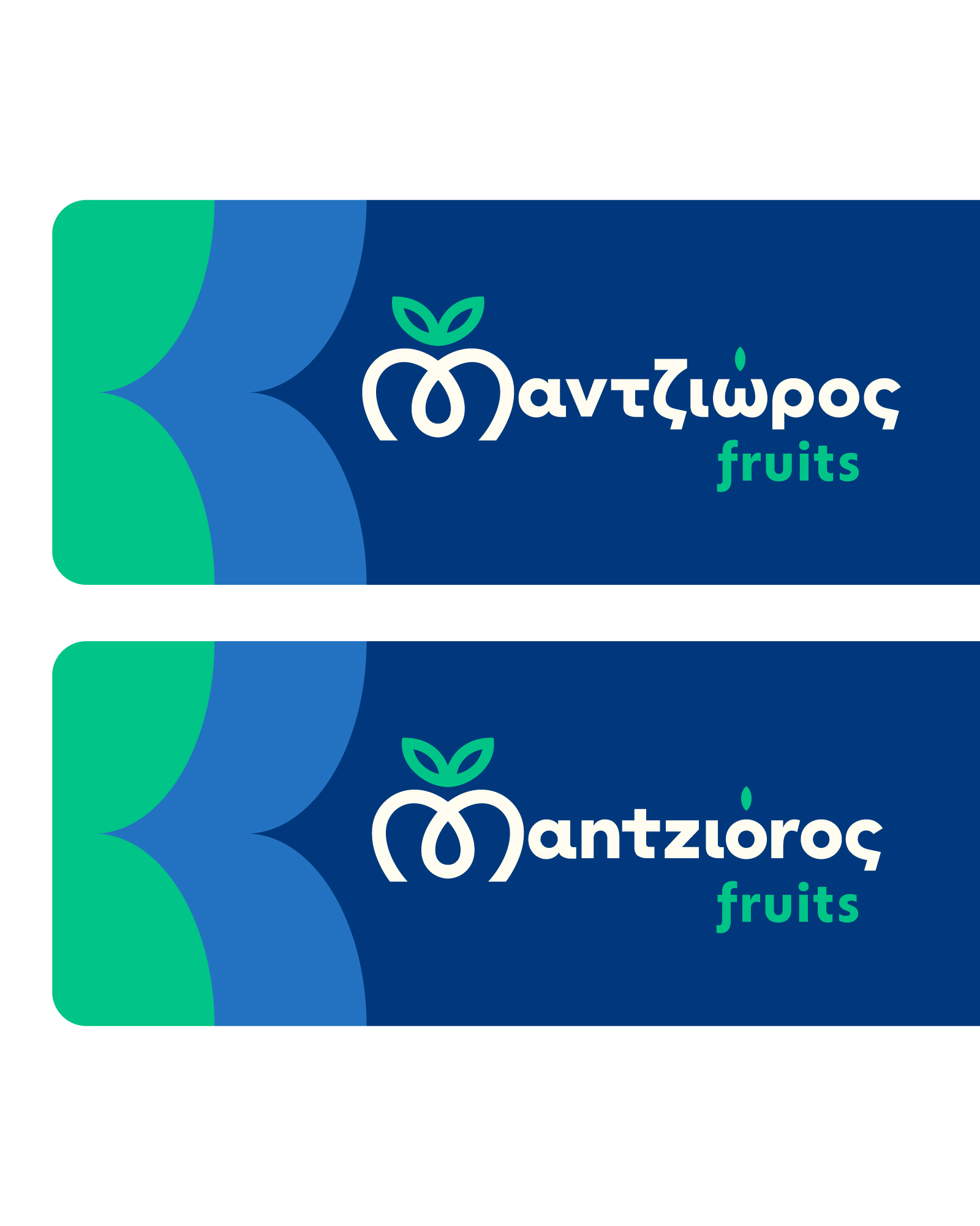
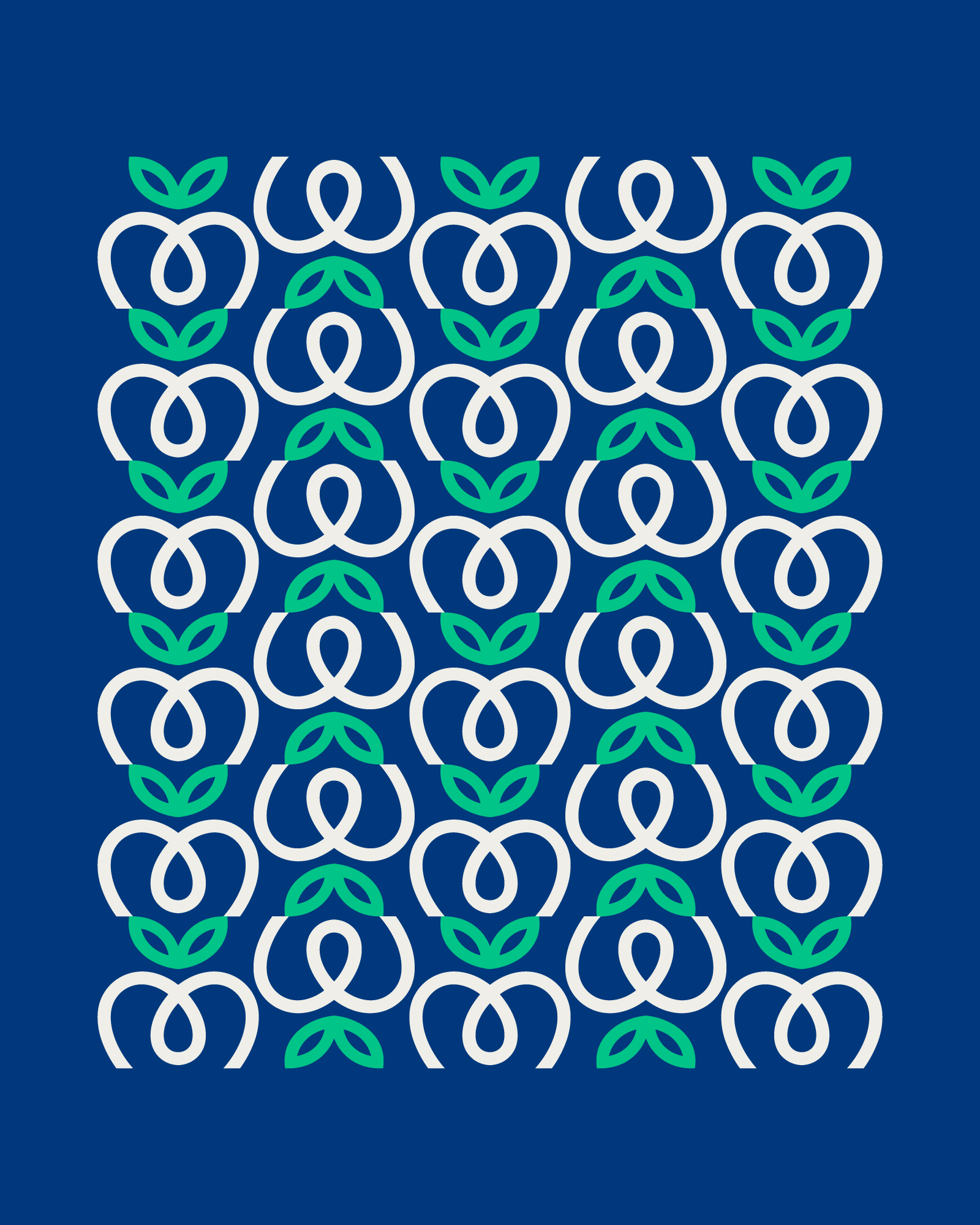
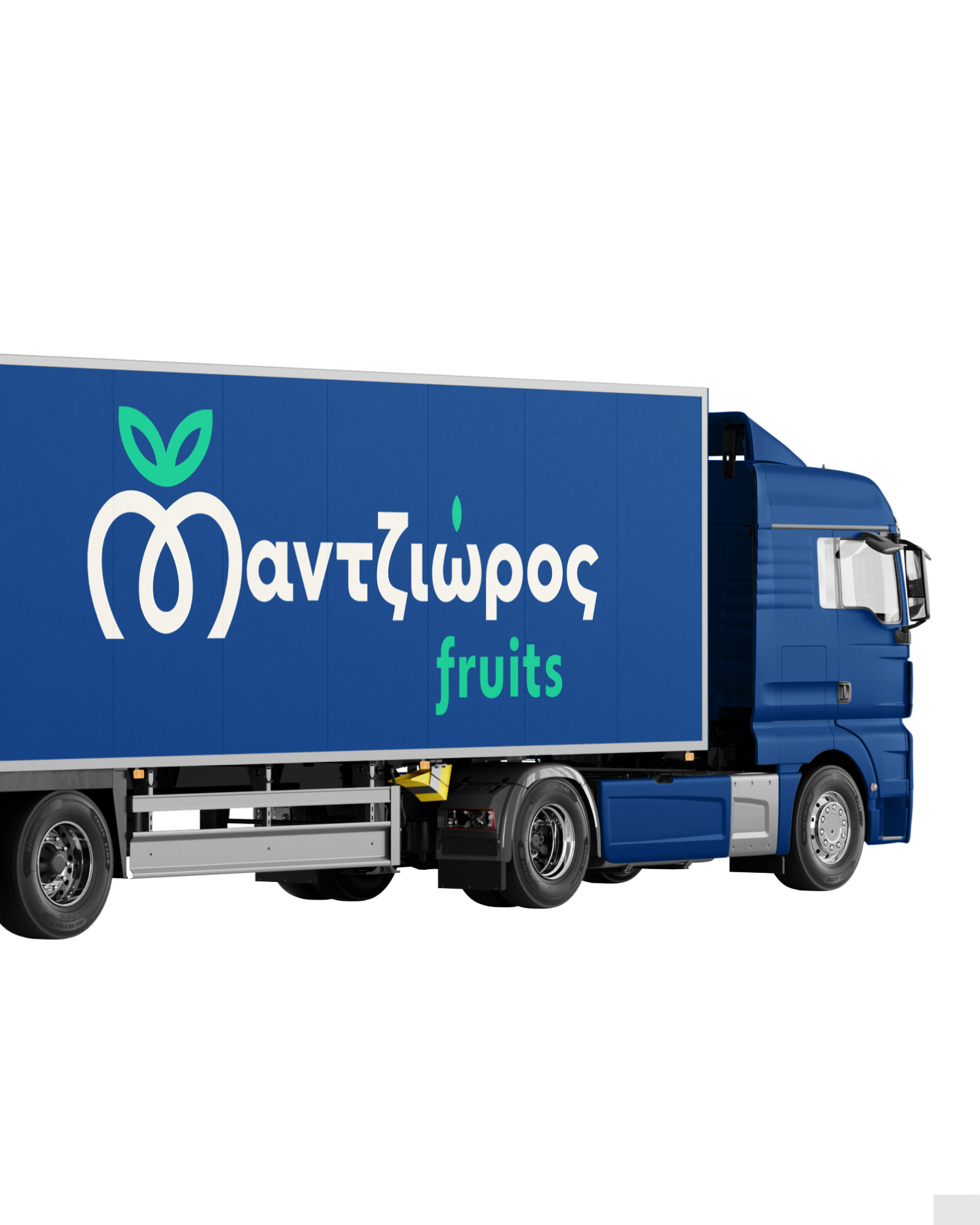
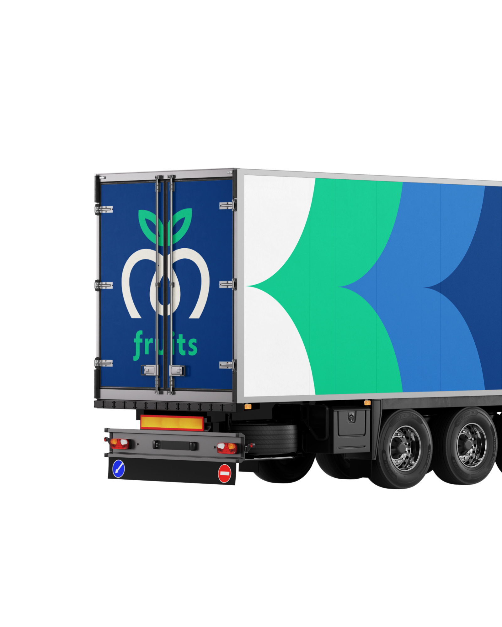
New visual identity for Mantzioros Fruits, with Greek and English logo versions and separate brand marks for flexible use. The concept is built around a clean, symmetrical symbol combining the letter M with fruit and leaf elements, a solid emblem rooted in mother earth, incorporating the water element needed for growth and fruition.
I designed it from the first sketch to the final files, working step by step with the client. I work from Corinth for businesses across Greece. If you want something similar for your own business, get in touch.
Images (11)

Related projects

Next projectCT Motive →